Claude Opus 4.8 vs 4.6
Same prompt, same project, two worktrees. What forty percent more money and 2.4× the wall clock actually bought.
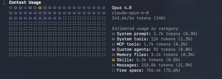
I started this experiment because Opus 4.8 was burning through tokens. As the project grew, my Max plan limits filled up fast. So I wanted to see for myself whether the peace of mind Opus 4.8 gives me is worth more than the lower token cost of Opus 4.6.
Opus 4.7 is not here because it sits far enough behind these two that you see the difference with the naked eye the moment you write a prompt.
I kept the setup as simple as I could, though not completely vanilla:
Project: Flutter. A note-taking application with 20,000+ lines of code that I am currently working on.
Goal: a mini tool that converts the selected note to PNG and saves it to the gallery. I left both the logic and the UI and UX design to the model.
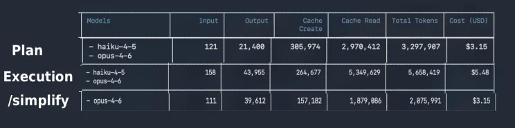
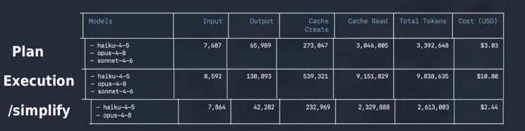
Method: after writing the prompt, I let the model drive by only answering its questions, because the models are what I am testing here. I gave the same prompt to both, on separate worktrees. There were three stages: first /plan, then implement, and finally /simplify, after which I evaluated the code. Each stage continued in a new, cleared session, because that is how a real flow would go.
Apart from that, the evaluation criteria in order of importance:
- Does the feature actually work?
- Did it write the code according to the coding standards I specified?
- Token cost
- UX and UI experience
- Perspective on edge cases
- Process time
Setup
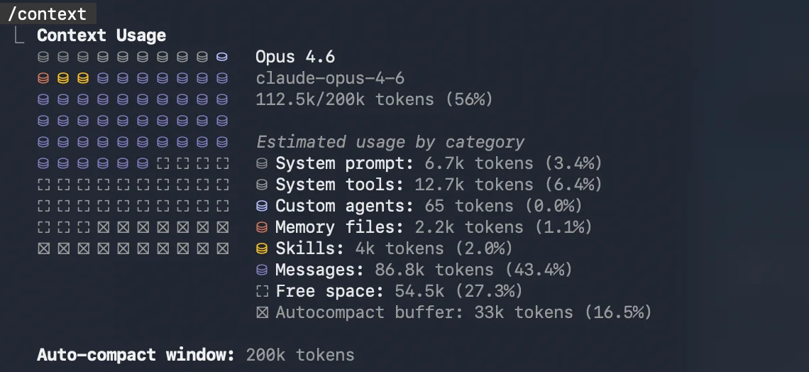
The CLAUDE.md file, as simple and plain as possible. Because of model routing, Haiku and Sonnet sub-agents show up in the runs, which is why I wanted to share it. And yes, I am using graphify too. It cut the context window by roughly 35%.
## graphify

This project has a knowledge graph at graphify-out/ with god nodes,
community structure, and cross-file relationships.

## IMPORTANT Modal Routing Rules

- Delegate ALL code reading, searching, and exploration to the `explorer` subagent.
- Delegate ALL file writing and editing to the `writer` subagent.
- Do planning, reasoning, and decision-making yourself (orchestrator);
  do not delegate these.
- Only delegate to `explorer` for substantial reads/exploration — for a single
  quick file read, read it directly to avoid subagent overhead.
The prompt
Now we will add a new feature to the elements we selected with the lasso element, there will be a screenshot feature icon and such.
When this is pressed, it will convert whatever elements there are to PNG without taking the background. What I want from you is:
1 — Converting to PNG. I want a really very beautiful, polished, cool, stylish, well thought out "screenshot" effect from you.
2 — The image of that cropped screenshot will appear on the screen. There, 2 options will appear: "Save to Gallery" and "Add Background." This can be in the form of on/off or active/passive. What I mean by "Add Background" is, you know there was no background in Clipboard — when we press this, it will add the background. From then on, whatever is there at that moment, whether it is a line, a canvas, whatever, it will add that too. Let this come as "off" by default. Every time the background setting is changed, it will convert to PNG again in the background. The preview in front of us will also show the background and it will be copied to me. But it does not have to be as flashy as the first screenshot effect; just seeing the result is enough.
3 — Let it somehow notify us that it has been automatically copied to the clipboard; I leave that part to your creativity.
Device performance is very important for us. Will we be able to render very large areas, very large selections? Will phones be able to handle this? We can talk about this; we can decide.
If there are things you do not understand, definitely ask me questions. Do not hesitate, you can ask many questions. At minimum, do 2 rounds, with 5 questions each. If ambiguous places remain, definitely ask more questions.
Results
Claude Opus 4.6, max effort
12 files changed, 166 insertions(+), 5 deletions(-)
Churned for 13m 11s
Strengths
- Both the plan and the implementation ran more than twice as fast as 4.8, in all three phases.
- It works.
- An acceptable UI design. It conforms to the design document.
- Mostly follows the architecture.
Weaknesses
- It failed on UX. When saving the image fails, the user sees nothing.
- It never tested anything itself. When I tested it, the first thing I got was a build error caused by versioning. It only solved that error once I copy-pasted it back in.
- With "add background" on, the background lines come out slightly shifted. Hard to see, and it raises no error. Some of the possible bugs Opus 4.8 left are here too.
- Tests?
- It did not update graphify. (Whether this is necessary is debatable.)
Total cost: $11.78
Claude Opus 4.8, xhigh effort
16 files changed, 278 insertions(+), 5 deletions(-)
Cogitated for 31m 48s
Strengths
- It works without a follow-up prompt.
- Design conforms to the document, but it could have been better.
- It shows the errors in the UI.
- Mostly follows the architecture.
- It wrote 6 mini tests that will at least say there is a problem when the code breaks.
- It also did the graphify update.
Weaknesses
- Roughly 40% more expensive.
- Render code that might cause a side effect, one misleading comment, and a few possible unmount-check gaps.
Total cost: $16.44
Conclusion
| Opus 4.6 (max) | Opus 4.8 (xhigh) | |
|---|---|---|
| Wall clock | 13m 11s | 31m 48s |
| Diff | 12 files, +166 / -5 | 16 files, +278 / -5 |
| Tests | none | 6 |
| Cost | $11.78 | $16.44 |
Opus 4.8 ran on "xhigh" and Opus 4.6 on "max" because the documentation says this kind of work does not need maximum effort on 4.8. It does not need it on 4.6 either, but 4.6 has no xhigh option, so max was the closest I could get.
Even with the forty percent gap, 4.6 leaves serious errors behind, the kind you overlook and then ask "where did this come from?" later. It shifts the background slightly. It does not crop from exactly the right place, and that is hard to spot.
Fixing graphify, writing the test cases, adding the UX that tells the user when saving failed, and above all solving the background bug all need extra prompt shots. That closes the price gap.
So I will take the peace of mind over the 2.4× time and the forty percent. Not always, but mostly. For small precision tasks, quickly changing a button colour or centring a div, dropping to Opus 4.6 in a hybrid setup like this is the efficient move.